
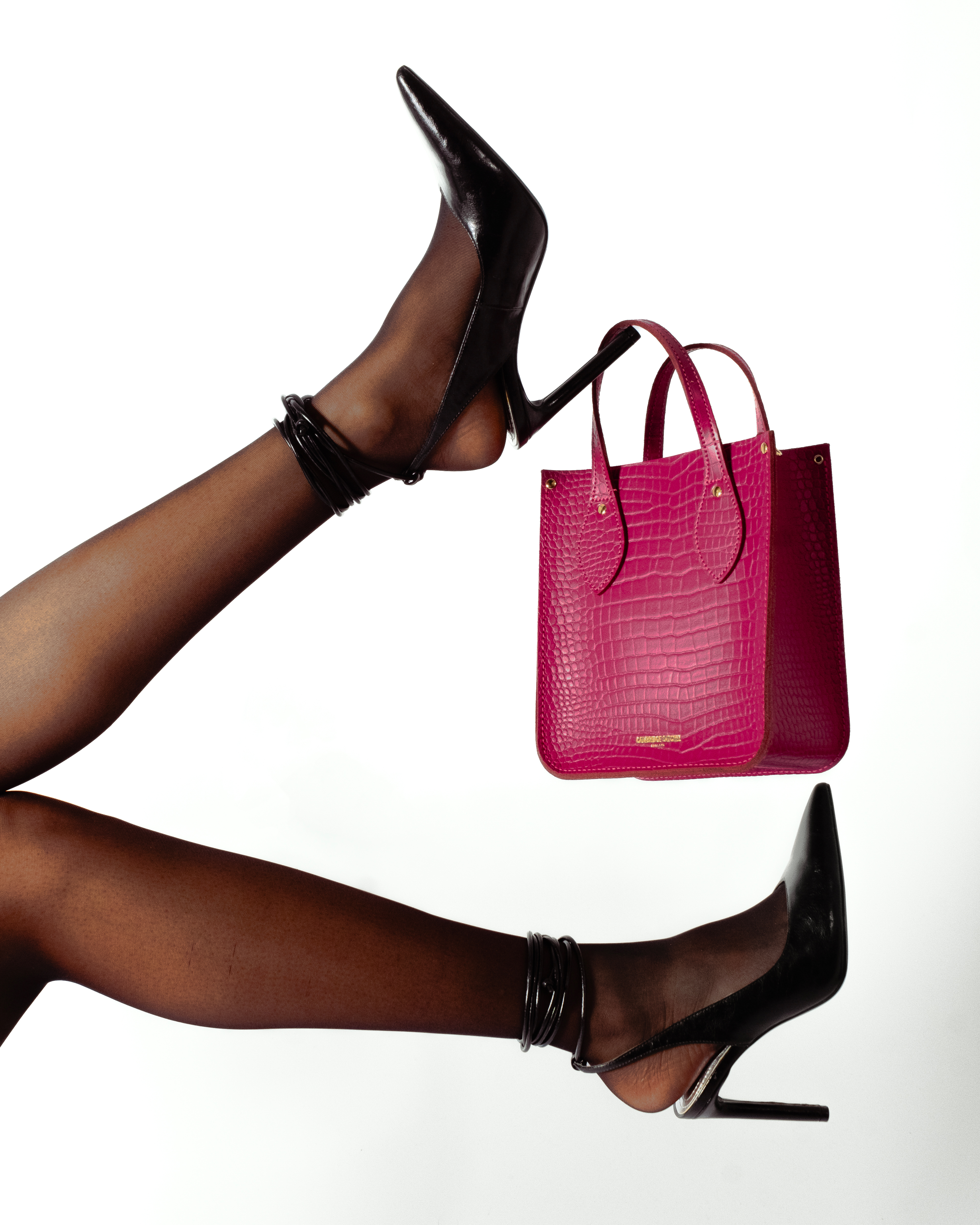
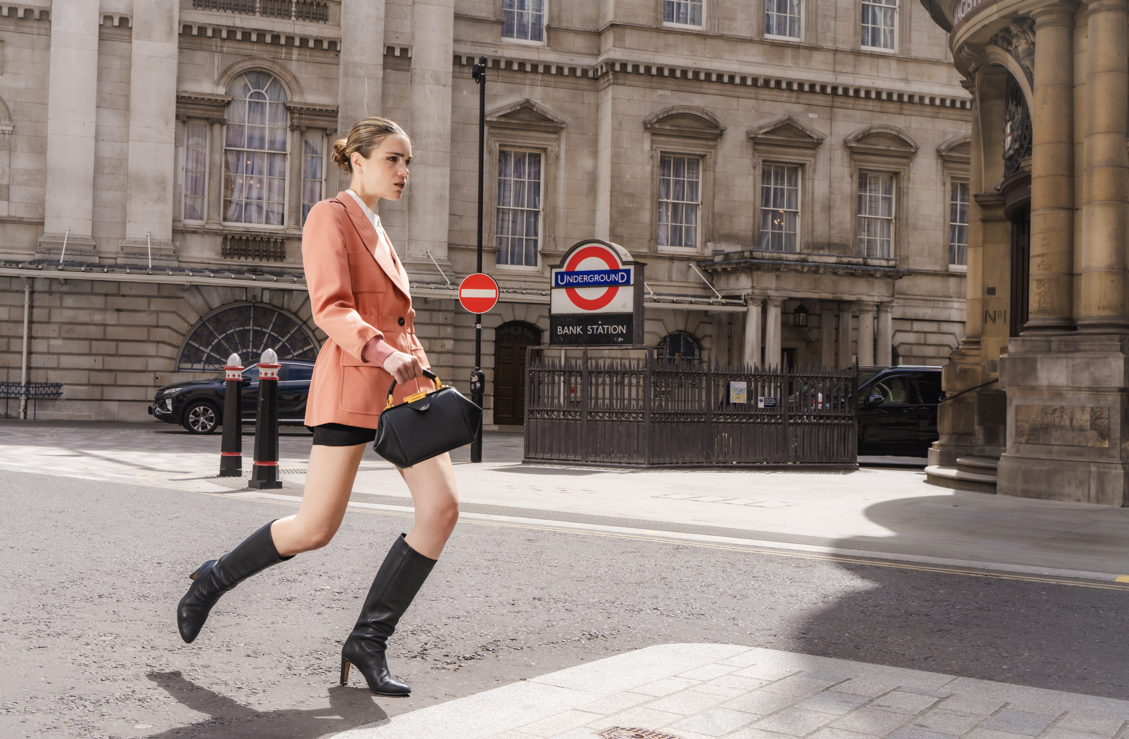
As Head of Image at Cambridge Satchel, I led the redefinition of the brand's visual identity, working closely with the creative and marketing teams to give it a more consistent, distinctive and contemporary expression of its British heritage. The colour palette and typography were refined, the photographic direction reshaped with a stronger focus on product, and styling adapted to better connect with the target audience. All built around the brand's core values, craftsmanship and heritage, and translated into a clear visual narrative across digital, social, print, retail and campaign assets. This identity underpins a true 360° creative approach, where campaigns and photoshoots reinforce the brand's tone of voice as much as they showcase the products. Since 2024, I have directed over 20 photo and video campaigns, some in collaboration with external brands or partners, including Universal Studios, Hello Kitty, Harvard University and the National Gallery.
This redefinition stemmed from a clear vision of what the brand needed to represent: a more modern, coherent expression that stayed true to its heritage while sharpening its positioning. The graphic charter, image style, typography, colour codes and layouts were revisited as the practical translation of that vision, applied consistently across every brand touchpoint.


This approach extended to store openings, ensuring visual cohesion between retail spaces and brand image. Packaging was also reconsidered, including a shopping bag conceived as a direct reference to the brand's most iconic product, the classic Satchel.


MAIN CAMPAIGNS
THE ARTISAN COLLECTION


THE CORE COLLECTION


AUTUMN WINTER 2026
![]()
![]()
![]()
![]()
![]()
THE SOFT COLLECTION
![]()
![]()
![]()
![]()
![]()
![]()


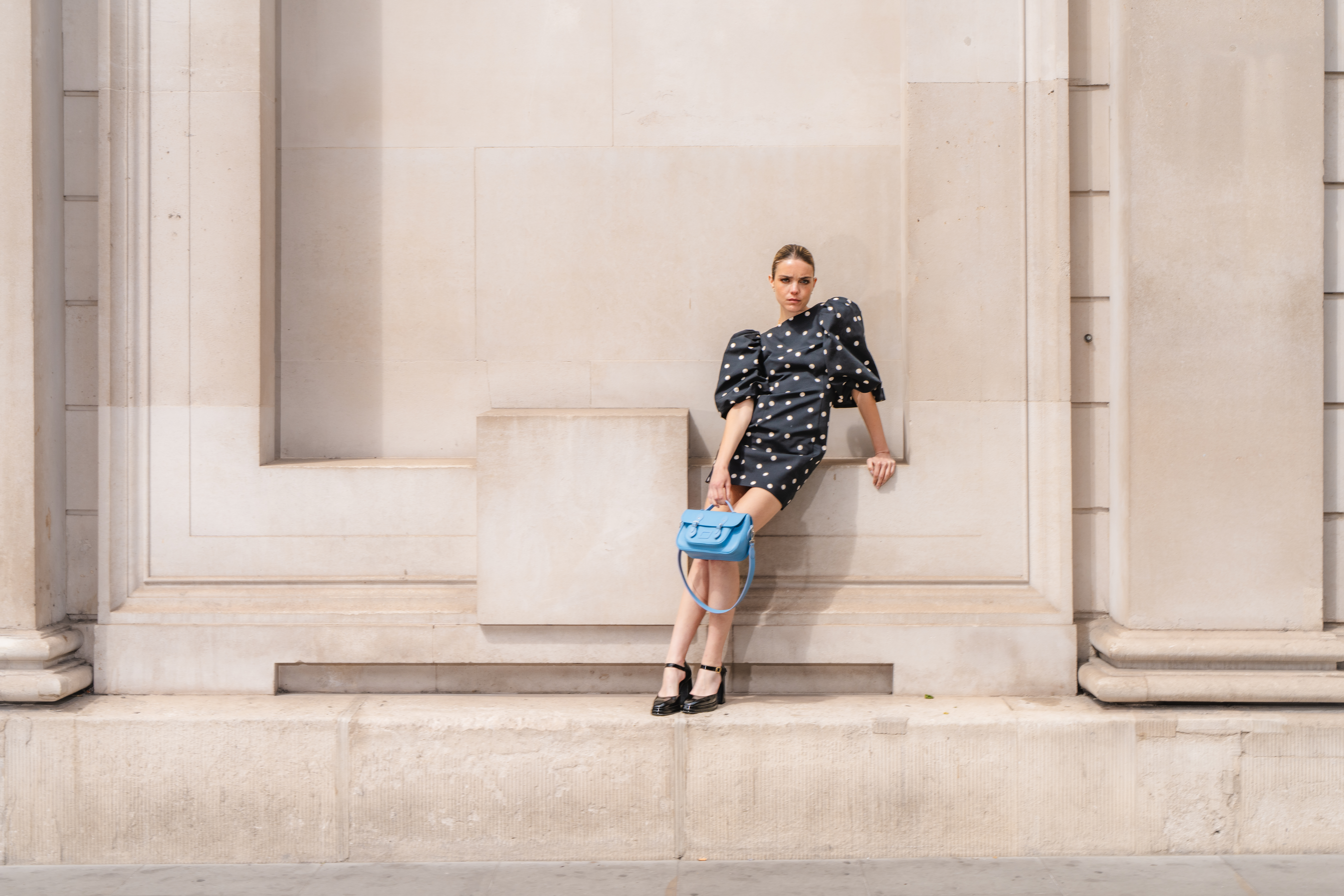
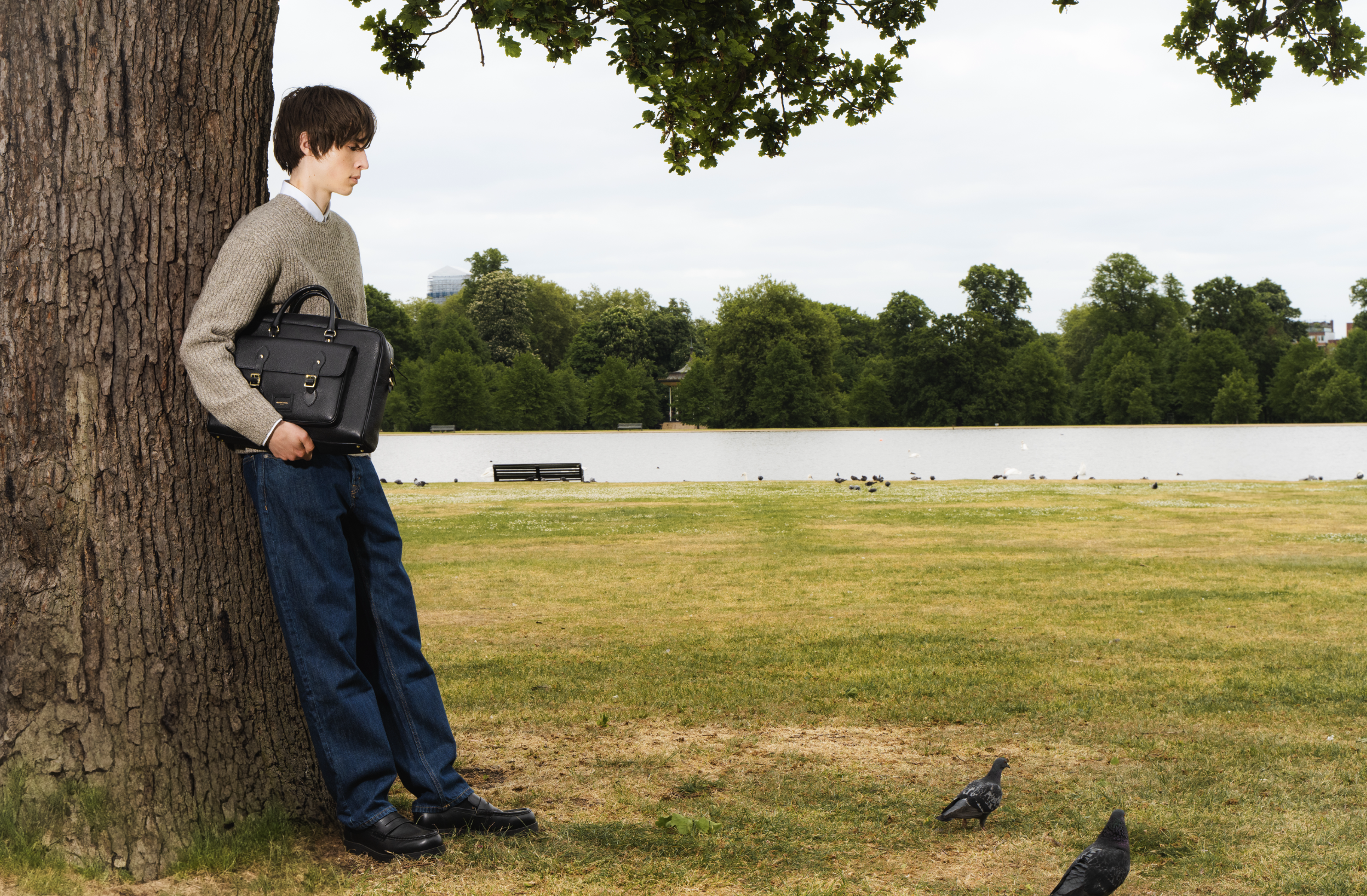

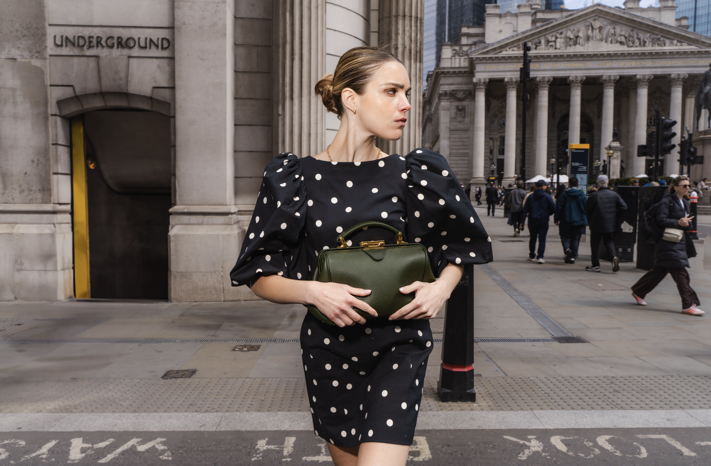

SPRING SUMMER 2026

AUTUMN WINTER 2025


SPRING SUMMER 2025
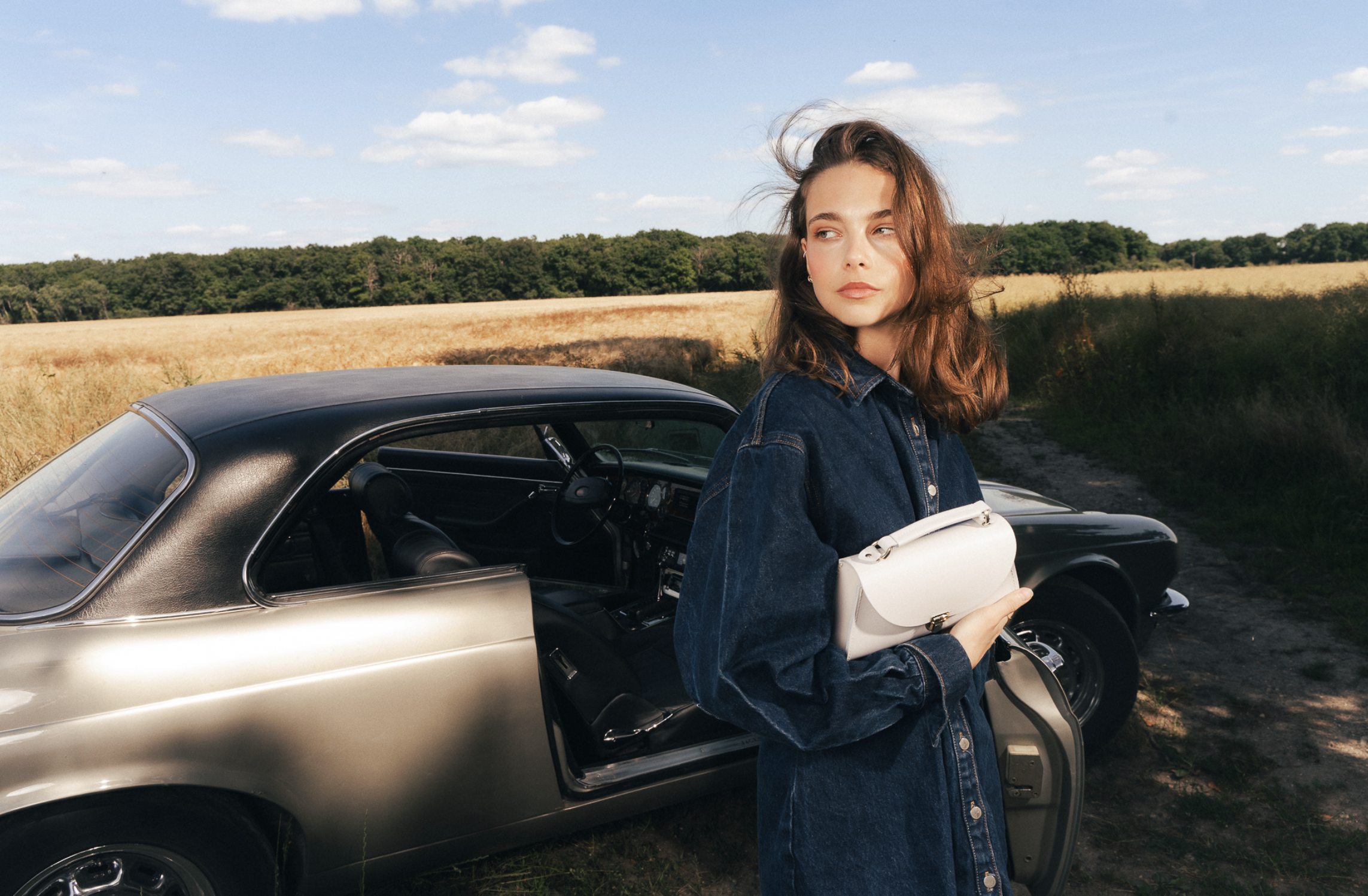


Brand collaborations play an essential role in shaping Cambridge Satchel’s image. The brand works with both culturally resonant partners, such as Hello Kitty, Wicked and Miffy, and established institutions with strong heritage, including Ivy League universities, Cambridge University and The National Gallery. Each collaboration calls for a careful meeting of two creative identities: staying true to Cambridge Satchel’s own visual language while thoughtfully introducing the partner’s universe. Through an ongoing creative exchange, the aim is to develop a final expression that feels coherent, authentic and aligned with both brands.


Founded in 1750, Swaine is a historic British luxury accessories house with a distinct heritage and a different clientele. Working with such a legacy brand required balancing tradition with innovation, respecting established codes while bringing a renewed creative vision. I revisited the brand guidelines, analyzed the evolution of its logos and visual universe through the centuries, and developed campaigns and photoshoots designed to modernize the brand without losing its refined British gentleman spirit. The goal was clear: to honour Swaine’s heritage while positioning it confidently in a contemporary luxury landscape.
I am also responsible for the creative consistency of new stores. The brand is expanding into new countries, which means that Swaine's identity must be clear and a common theme must be maintained in our new stores.
NEW STORES OPENINGS
Since 2025, Swaine has entered a new phase of international expansion, opening its heritage to a wider global audience. I had the opportunity to contribute to the creative development of this retail vision by working closely with the architects from Othello agency on the Swaine stores in Montreux Switzerland, Beverly Hills Los Angeles and on Avenue George V in Paris.
Being involved in the process from the initial idea to the final execution was a particularly enriching experience. From concept development and floor plans to material choices, architectural details and discussions with the construction teams, I was able to discover new areas of expertise and take part in the creation of a store from beginning to end.
The Beverly Hills and Montreux’s stores has now come to life, while the George V store in Paris is currently under construction.
BEVERLY HILLS PROJECT
FROM PLANS


TO REALITY


LAST CAMPAIGNS
SPRING SUMMER 25


AUTUMN WINTER 26


RENAULT 5 — R5VOLUTION IS BACK


PUBLICIS CONSEIL, PARIS 2023–2024
Launching a car is not a single campaign. It is a long, layered process in which every touchpoint (film, print, OOH, activations, collaborations, events, social content) must carry the same energy while speaking to entirely different audiences, contexts and formats. The Renault 5 relaunch was exactly that kind of project.
The challenge was both cultural and commercial : reintroduce a mythical French car to a new generation, while making the world feel that something genuinely exciting was happening. Not just a product launch but also a cultural moment.


Working at Publicis Conseil alongside creative directors Pierre Dumont and Gurvan Prioul, I had the opportunity to contribute to several simultaneous expressions of this single idea. The campaign unfolded across multiple angles at once : a bold print and film campaign built around the concept of "BR5AK THE RULES", a Roland-Garros partnership that merged sport, fashion and French identity, a pop-up activation and a large-scale mural painted live on the
streets of New York "Le Car is Back" that turned the launch into a street-level event.


What made this project genuinely formative was precisely that simultaneity. The same product, the same core idea, declined across a film, a fashion shoot, a painted wall in Manhattan, an experiential pop-up, a press campaign, and more. Each piece had to work on its own and as part of something larger.
Being part of a team operating at this scale, where global reach, cultural resonance and creative coherence had to be maintained across every format and every market at the same time gave me a concrete understanding of what it means to think in 360°, not just execute within it.
BDK PARFUMS
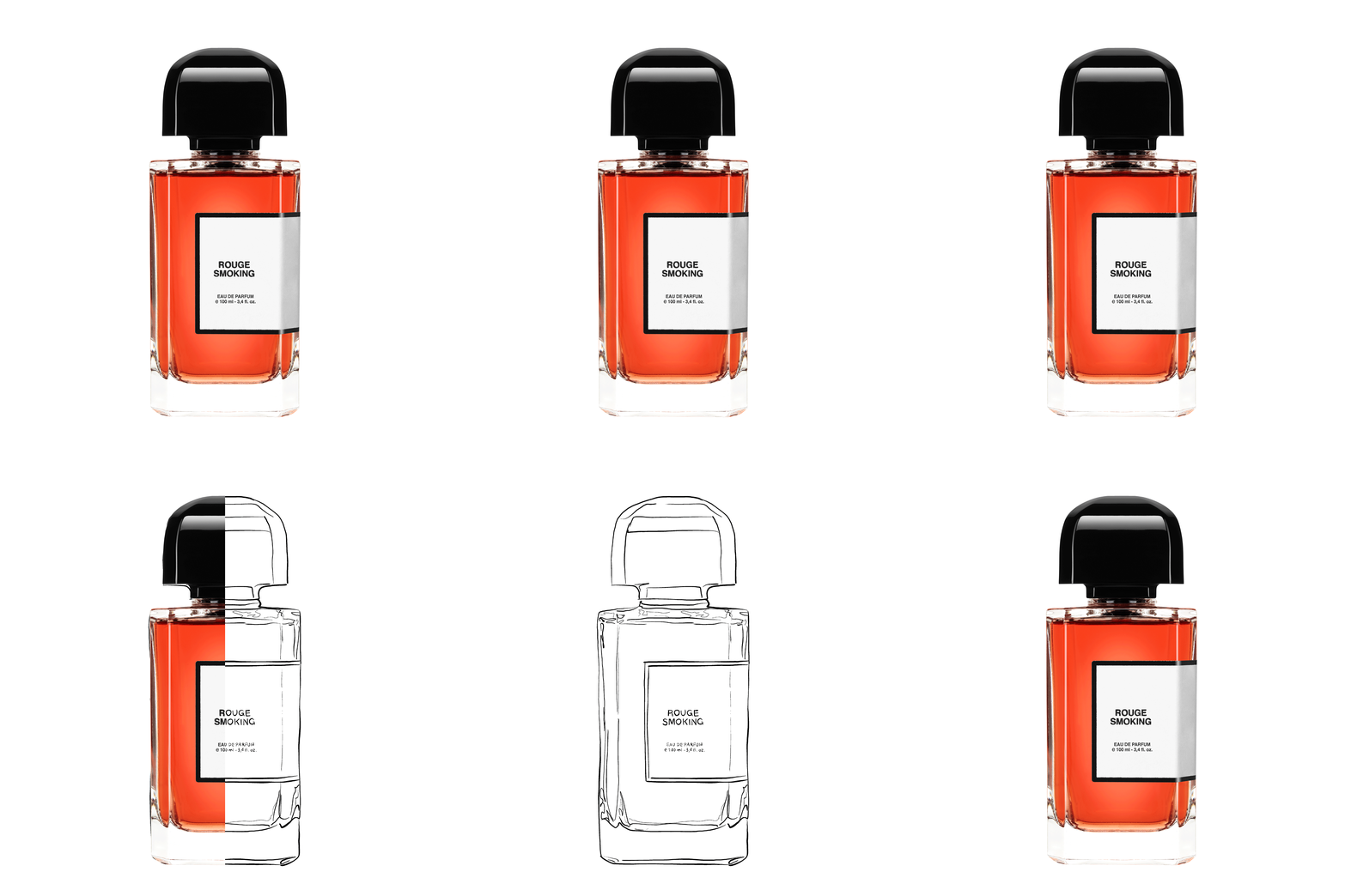
The project for BDK Parfums centered on reimagining the iconic bottle of Rouge Smoking by creating a deeper, more intense visual atmosphere.

I developed illustrated renderings inspired by the fragrance’s key ingredients, playing with smoky textures and rich, bold colors to evoke warmth and sensuality. The project also included motion design and digital animations for the brand’s online platforms.

GAITÉE LYRIQUE
The project for La Gaîté Lyrique involved a complete visual identity redesign for this immersive cultural space. personal test project
La Gaîté Lyrique hosts exhibitions, live performances, concerts, talks, workshops, and digital art events. The new identity was conceived to reflect its hybrid and forward-thinking programming, blending music, contemporary art, and digital culture. The challenge was to create a flexible and expressive visual system capable of adapting to a wide variety of formats, using the G as a base.


MORPHEA
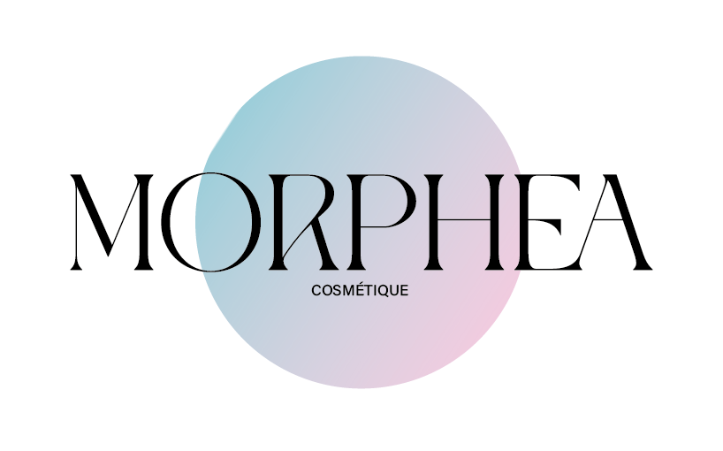
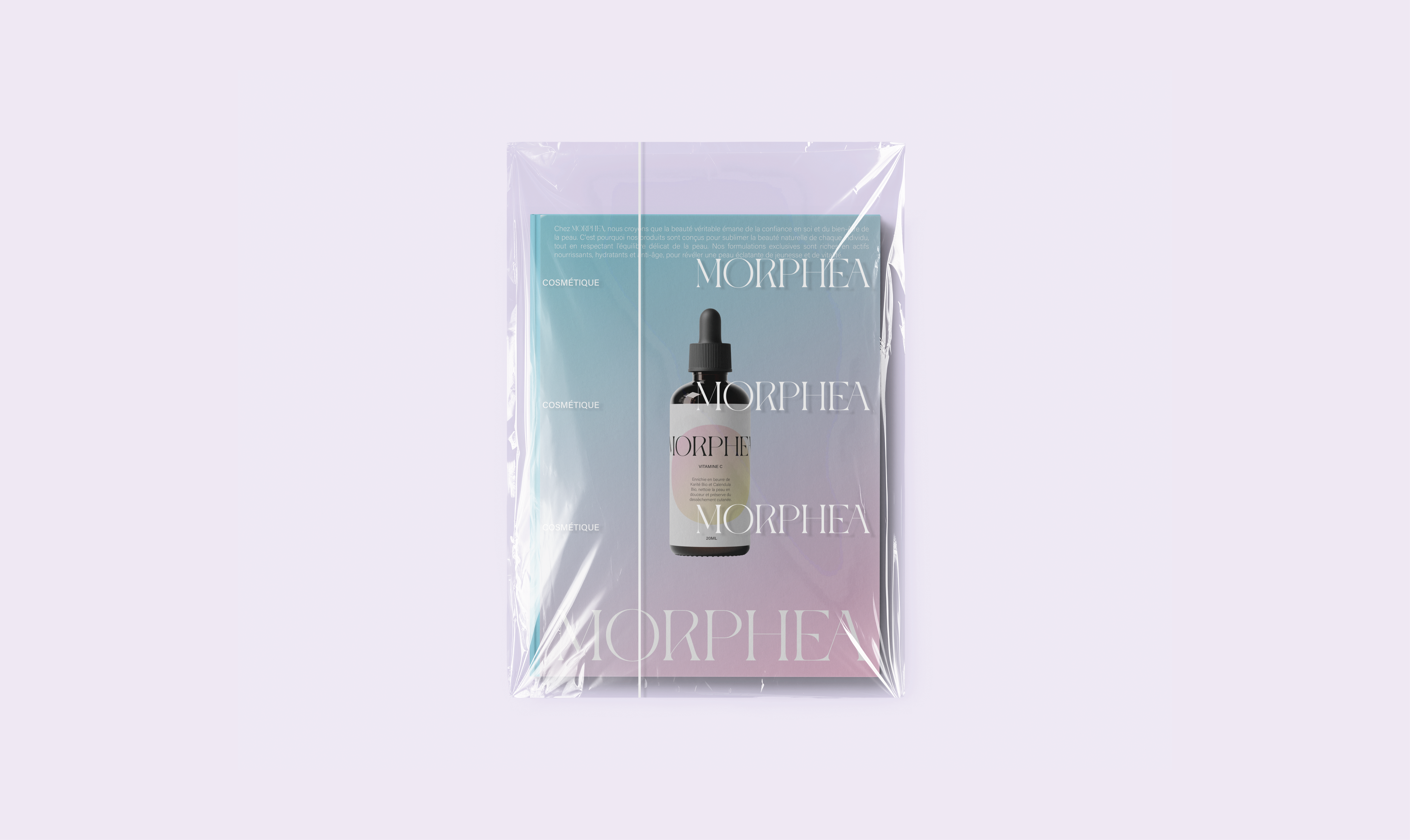
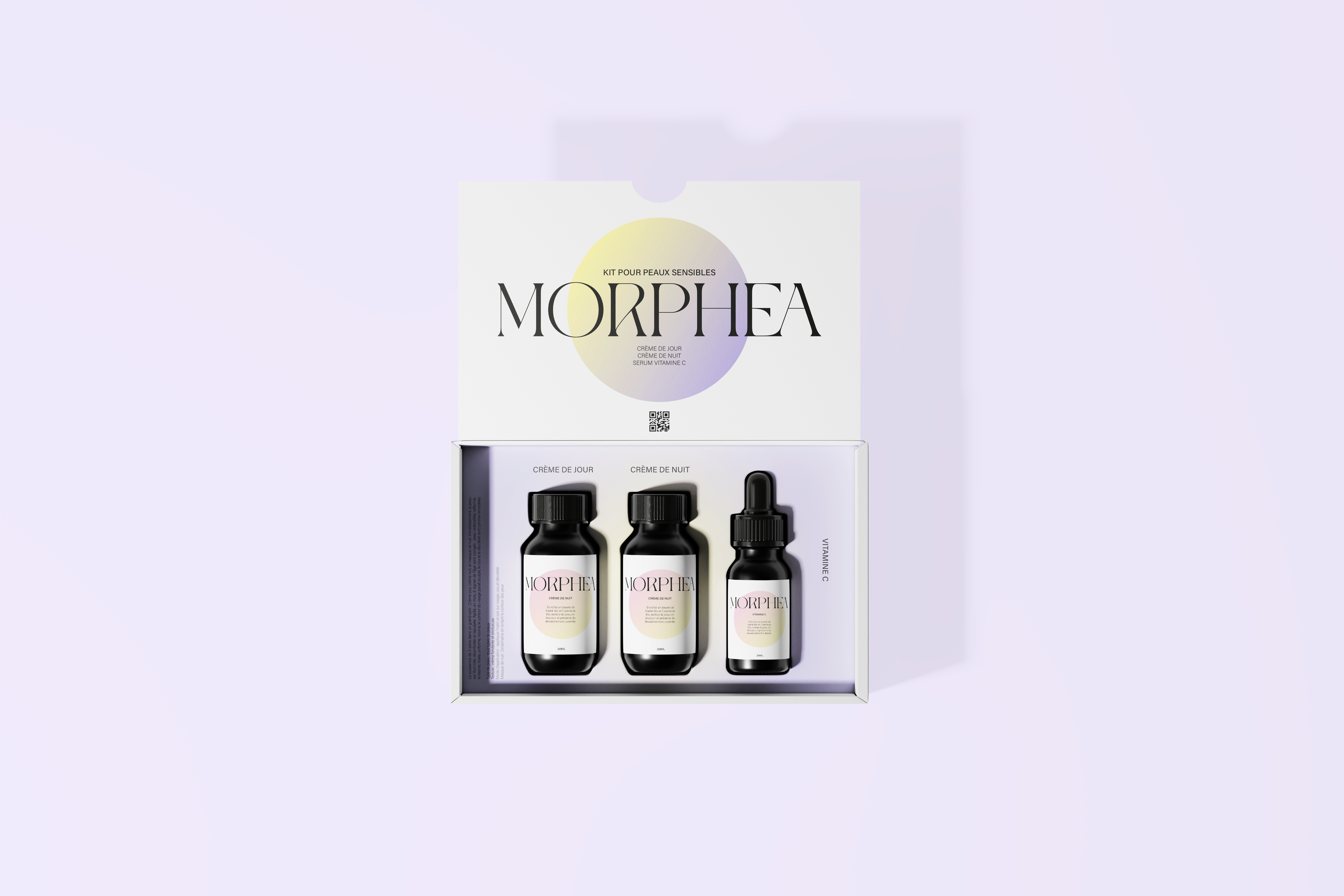
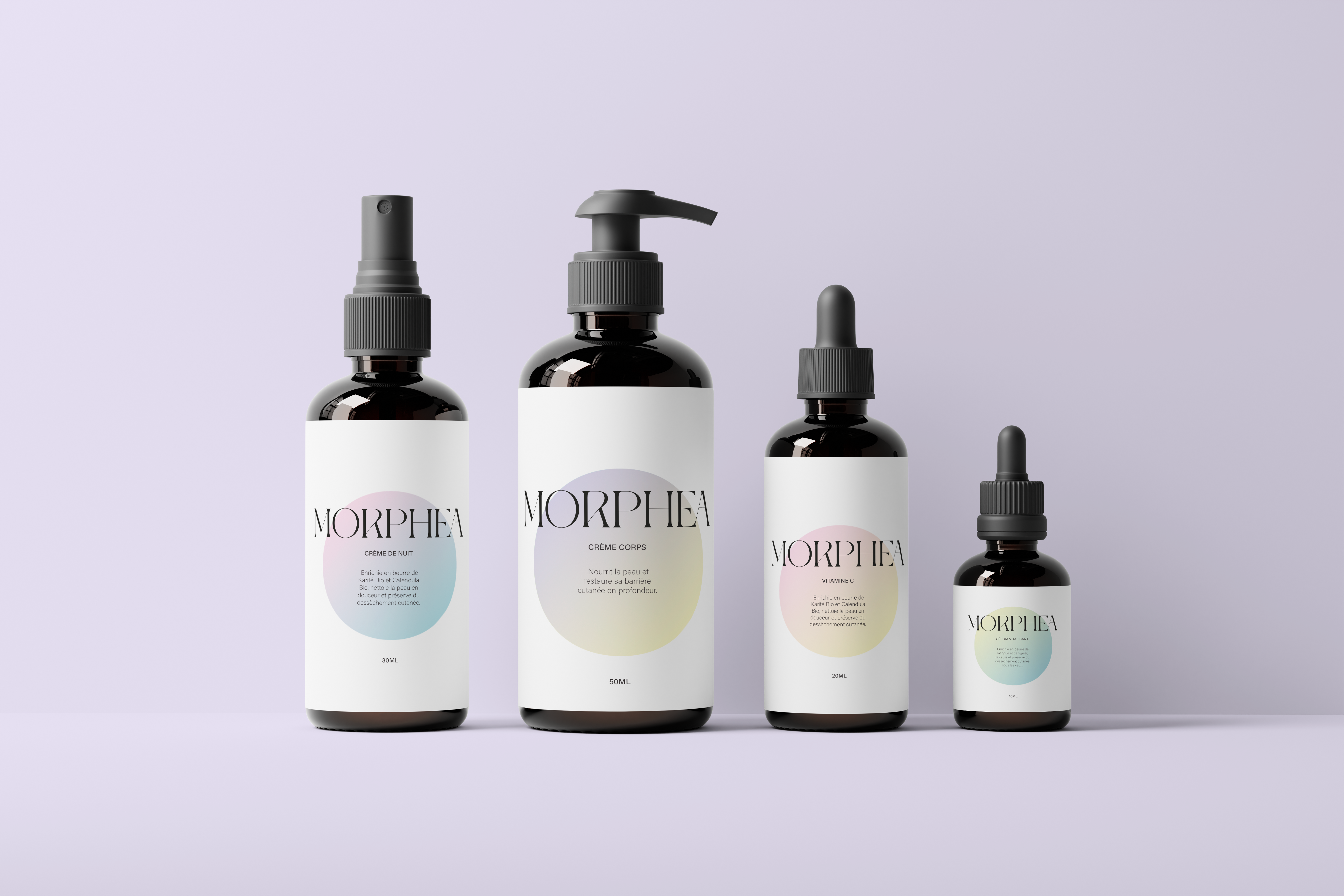
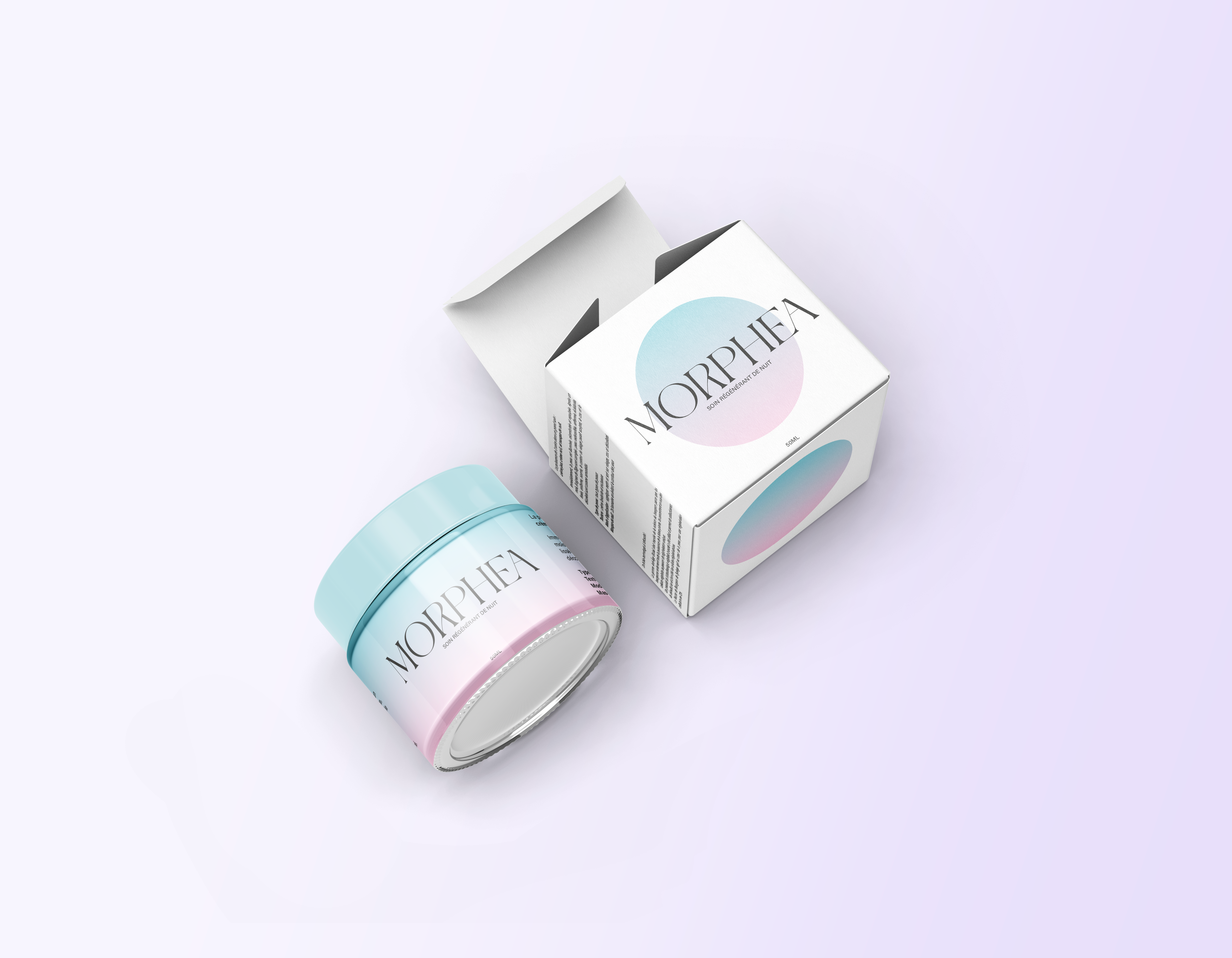
Morphea is an emerging cosmetics brand for which I developed the visual identity and packaging design.
The concept was built around a soft, skin-friendly universe. This gentle and non-aggressive approach was expressed through a delicate color palette and smooth, organic shapes, creating a calming and reassuring aesthetic that reflects the brand’s philosophy.

CONTRASTE
CONTRASTE is a magazine created in collaboration with Axelle Calif and Chiara Givone. It explores the social and cultural contrasts between Parisian suburbs — some extremely affluent, others underprivileged.


The publication highlights emerging talents from these areas, giving space to their culture, voices, and stories. The editorial approach balances strong visual identity with thoughtful storytelling.


OLIVIA BEE
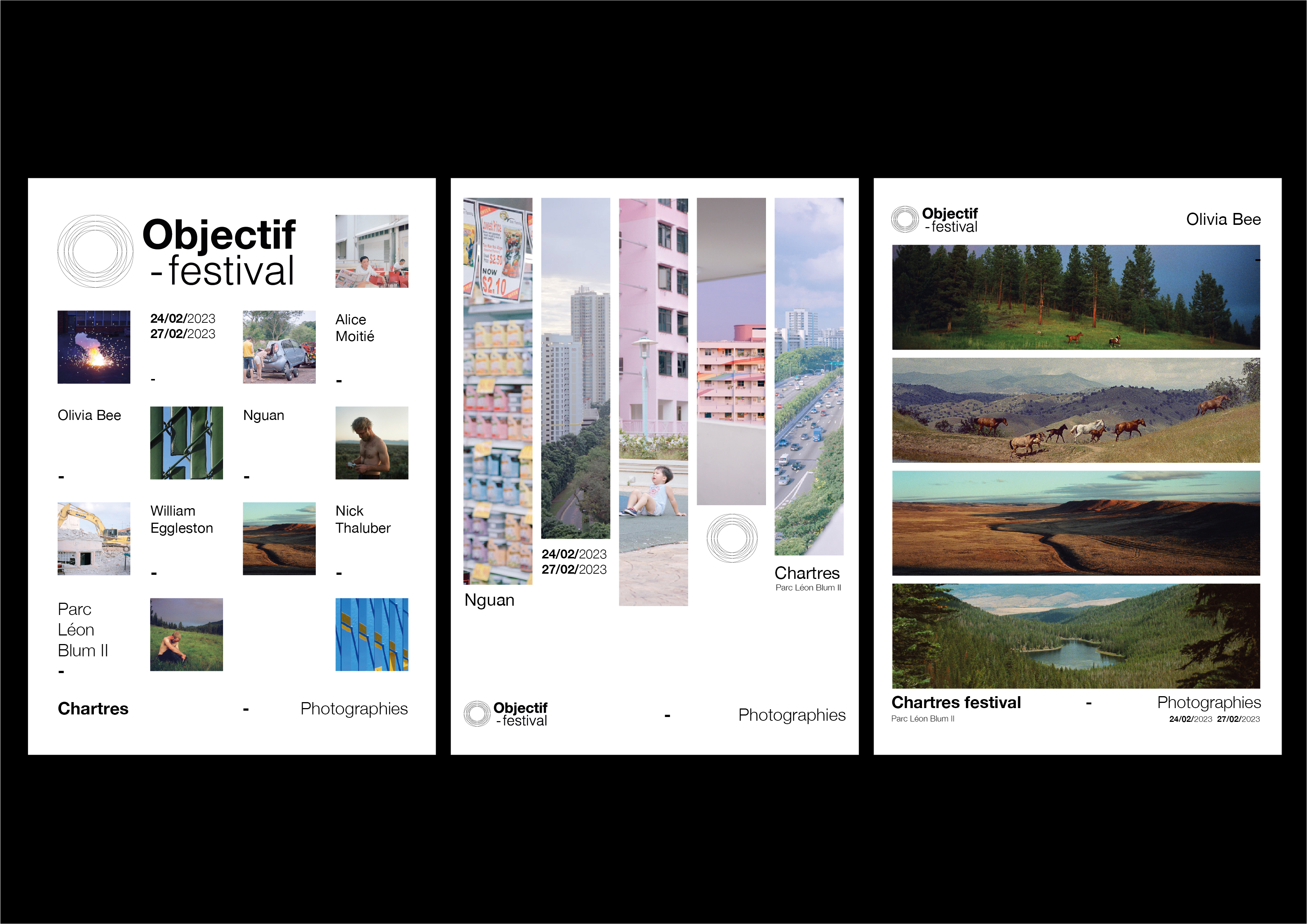
I designed a photobook featuring the work of Olivia Bee. Her universe is intimate, dreamy. Capturing youth, spontaneity, and nostalgia through soft light and raw authenticity.


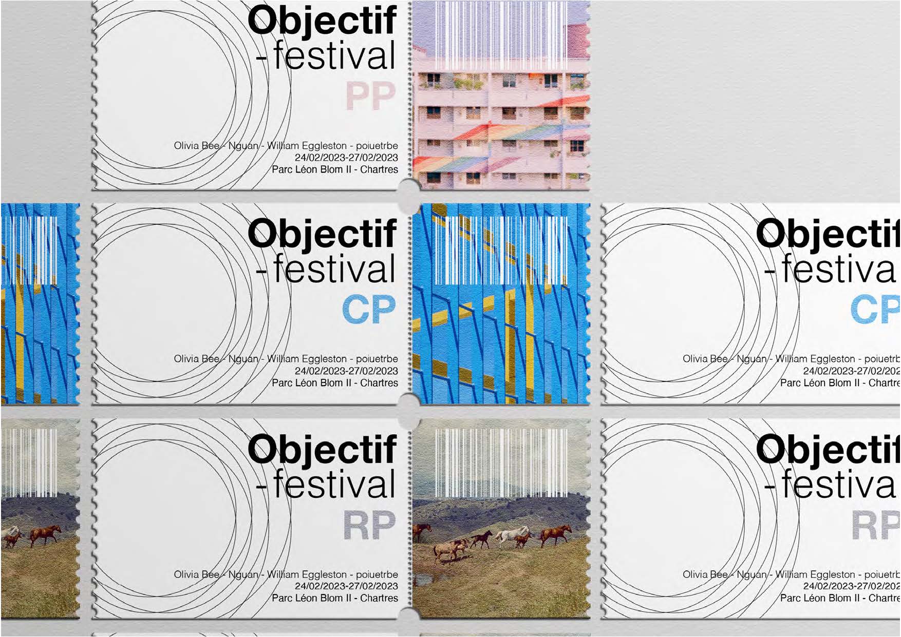
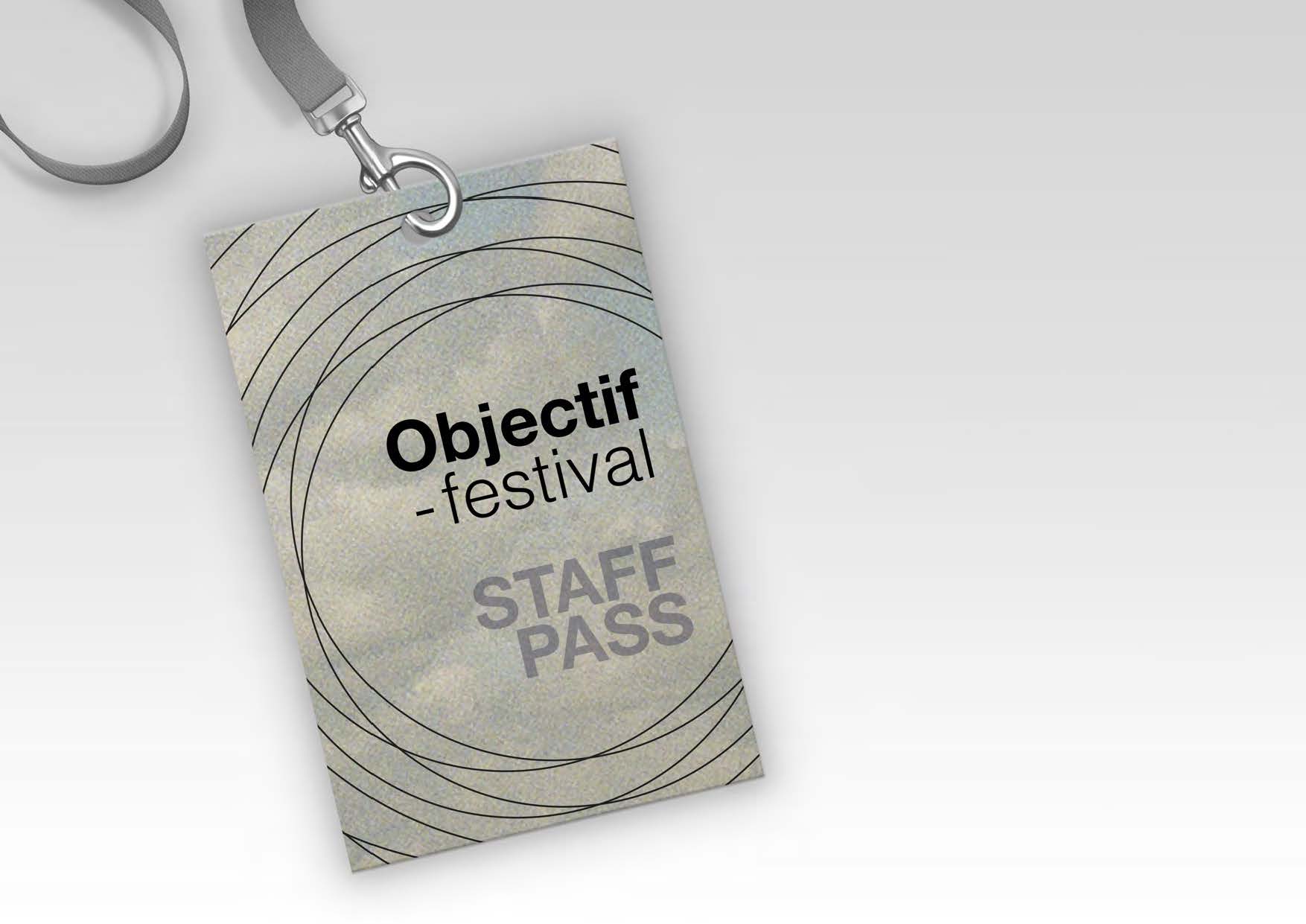
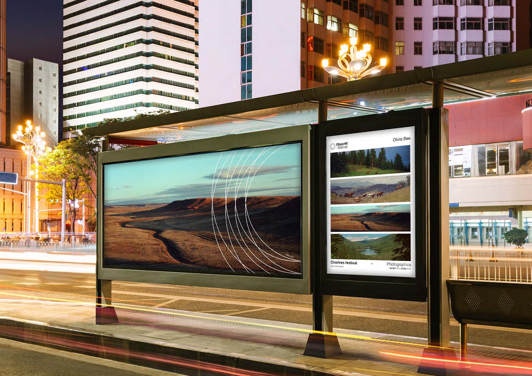
In parallel, I developed visual materials for a photography festival in which she was prominently exhibited, extending her poetic aesthetic into a broader spatial and graphic experience.

COSOMOBOOKS
COSMOBOOKS is a multi-volume book series dedicated to space exploration and the history of space conquest. The iconographic research was particularly compelling, combining archival imagery, scientific visuals, and structured layouts to create an immersive and informative reading experience.


